
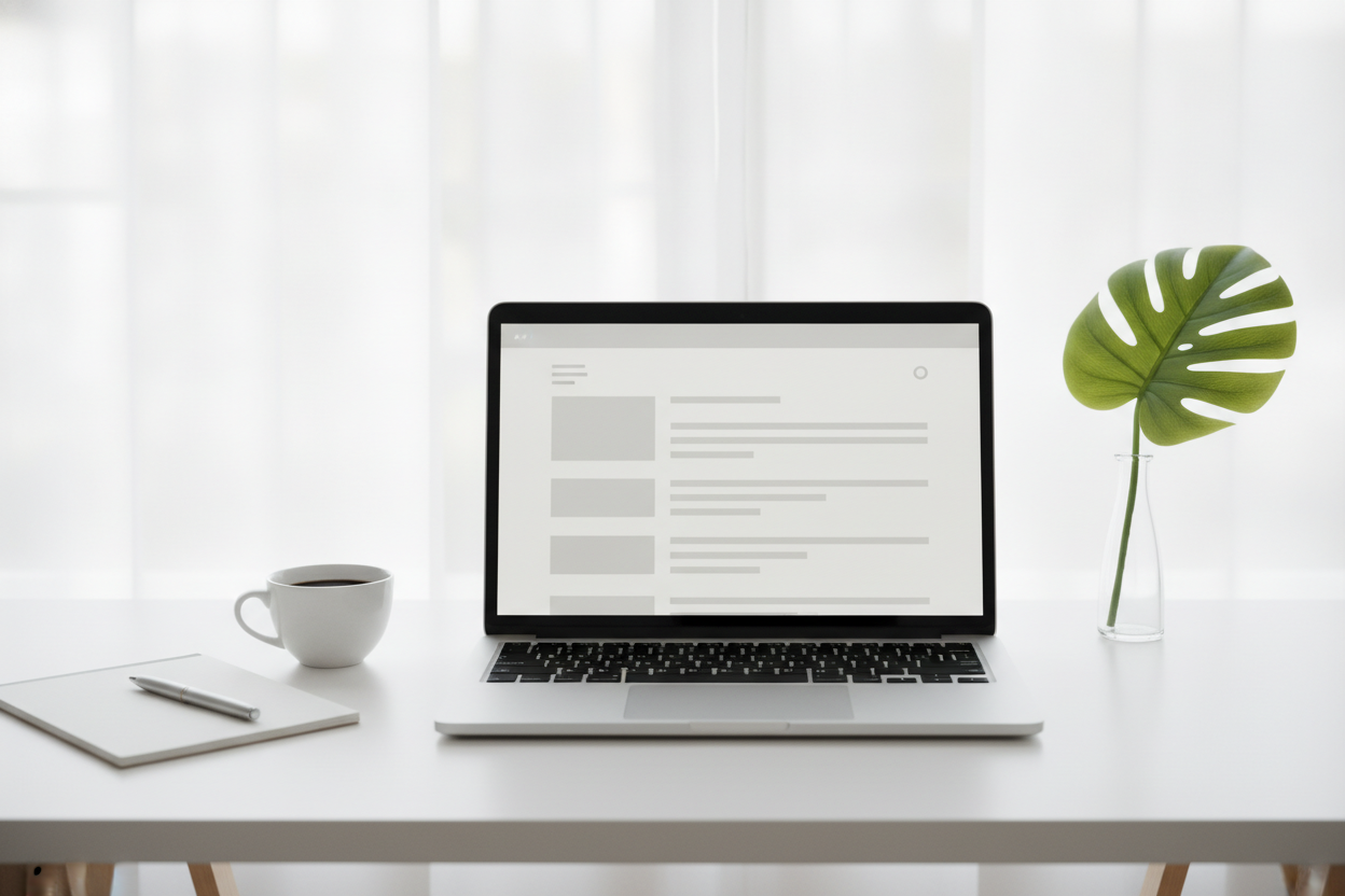
Minimal blog design is one of the easiest ways to make a personal site feel calm and inviting. When a homepage is uncluttered, visitors can focus on the posts instead of sorting through extra visual noise. That matters especially for a simple blog, where the writing should remain the main attraction. A lightweight layout also feels modern and easier to maintain, which is ideal for beginners building their own site.
A strong minimal design starts with readable typography. Choose a font that is clear on both desktop and mobile, and give the text enough line spacing to feel comfortable. White space is just as important as the content itself because it helps each post breathe. A narrow content column often works better than a wide one, since it makes paragraphs easier to scan and encourages readers to stay engaged.
Navigation should stay straightforward. Your homepage can highlight recent posts, while the post page should let readers move directly into the article without distraction. Keep menus short and labels obvious. If a visitor has to think too hard about where to go next, the design is no longer doing its job. Simplicity should reduce friction, not create it.
Minimal design is also about consistency. Use the same spacing, color palette, and post format across the site so everything feels intentional. When the structure is predictable, your writing feels more polished even if the content itself is personal and informal. A minimal blog does not need to be empty; it simply needs to be focused. That focus makes the reading experience smoother and the site easier to enjoy.
Leave a Reply