
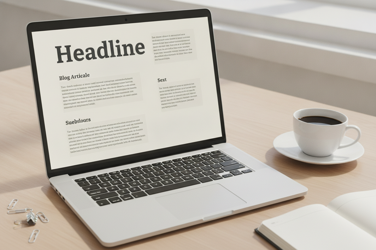
Typography does a lot of quiet work on a blog. Even if readers do not notice it directly, they feel its effect in how comfortable the page is to read. Good typography makes a site feel polished, while poor typography can make even strong writing tiring to finish. For a simple personal blog, the best choice is usually the one that supports clarity first and style second.
Start with legibility. The body text should be easy to read at a normal distance on both phones and larger screens. A font with clear letterforms and a reasonable size will usually serve you better than something decorative. Pair that with enough line spacing so each paragraph feels open rather than crowded. This small adjustment can transform the reading experience more than many visual effects ever could.
Hierarchy matters too. Titles should stand out from the body text, but not in a way that overwhelms the page. On a minimal blog, a simple hierarchy helps readers understand where one post begins and another ends. Consistent spacing around headings, titles, and metadata creates a rhythm that feels calm and intentional.
Typography also influences the personality of the blog. A clean serif can feel thoughtful and literary, while a modern sans serif can feel fresh and direct. Either can work well for a personal writing journal depending on the tone you want to create. The main point is consistency. When the type choices are steady across the site, the design feels cohesive and the writing gets the attention it deserves. Good typography is not decoration alone; it is part of the reading experience.
Leave a Reply